
AUSSIELENT (now known as Qota)
BRANDING, ART DIRECTION, PACKAGING & WEBSITE
The balanced meal to balance you.
Although they had seen much success in the market with their unique meal replacement formulations, Aussielent approached BrandWorks with their existing brand, needing to appeal to a wider market. The core elements from its existing brand were utilised in the new direction to ensure continuity and preserve brand value. As an eCommerce online retailer, exceptional branding was crucial to its business platform.
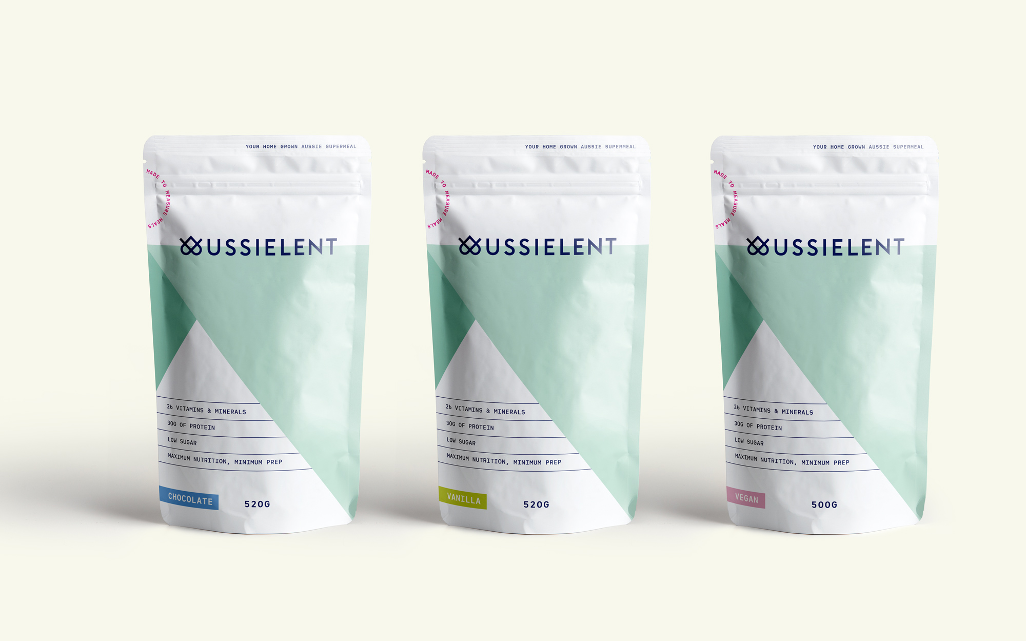
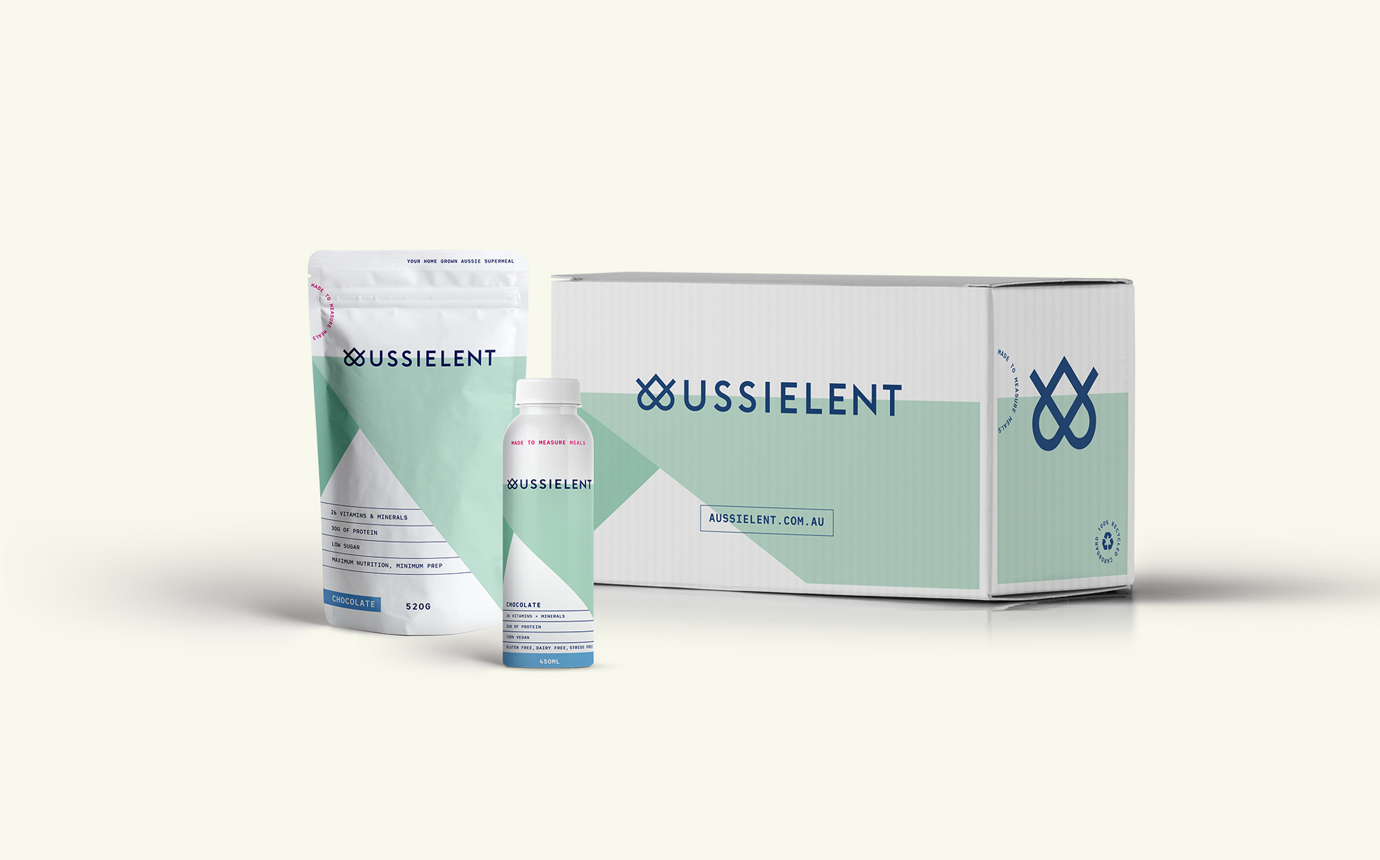
The existing Aussielent heart-flower brandmark was stripped back to reimagine and neutralise the brand in relation to gender. A punchy tagline, 'Made to Measure Meals' was developed to clearly communicate the brand's offering. More than the sum of its parts, the geometric brandmark and secondary system demonstrate the coming together of multiple inputs in a harmonious, efficient, and beautiful system. The end result is a calm, calculated, modern brand that uses symmetry mixed with a playful human touch.
All of the existing packaging were redesigned, utilising a cleaner and clearer modern design aesthetic with a larger emphasis on the brandmark than ever before. The gentle hues of turquoise and navy blue provides an striking eye-catching contrast to convey the health and nutritional qualities of the brand.
Aussielent is the smarter choice in food, giving you a nutritionally complete and balanced meal, that's convenient, Australian-made and designed to meet the demands of the modern active lifestyle, everyday.
By partnering with BrandWorks in 2023, Aussielent was able to smoothly transition to their new brand identity as Qota.


VIEW BRANDING VIDEO