Spring Place (ISPT) - Melbourne
Strategy / Placemaking / Naming / Branding / Copywriting
Create, work & thrive!
For ISPT, the mission for Australia’s largest property superfund is to create growth, delivered through “places that work”.
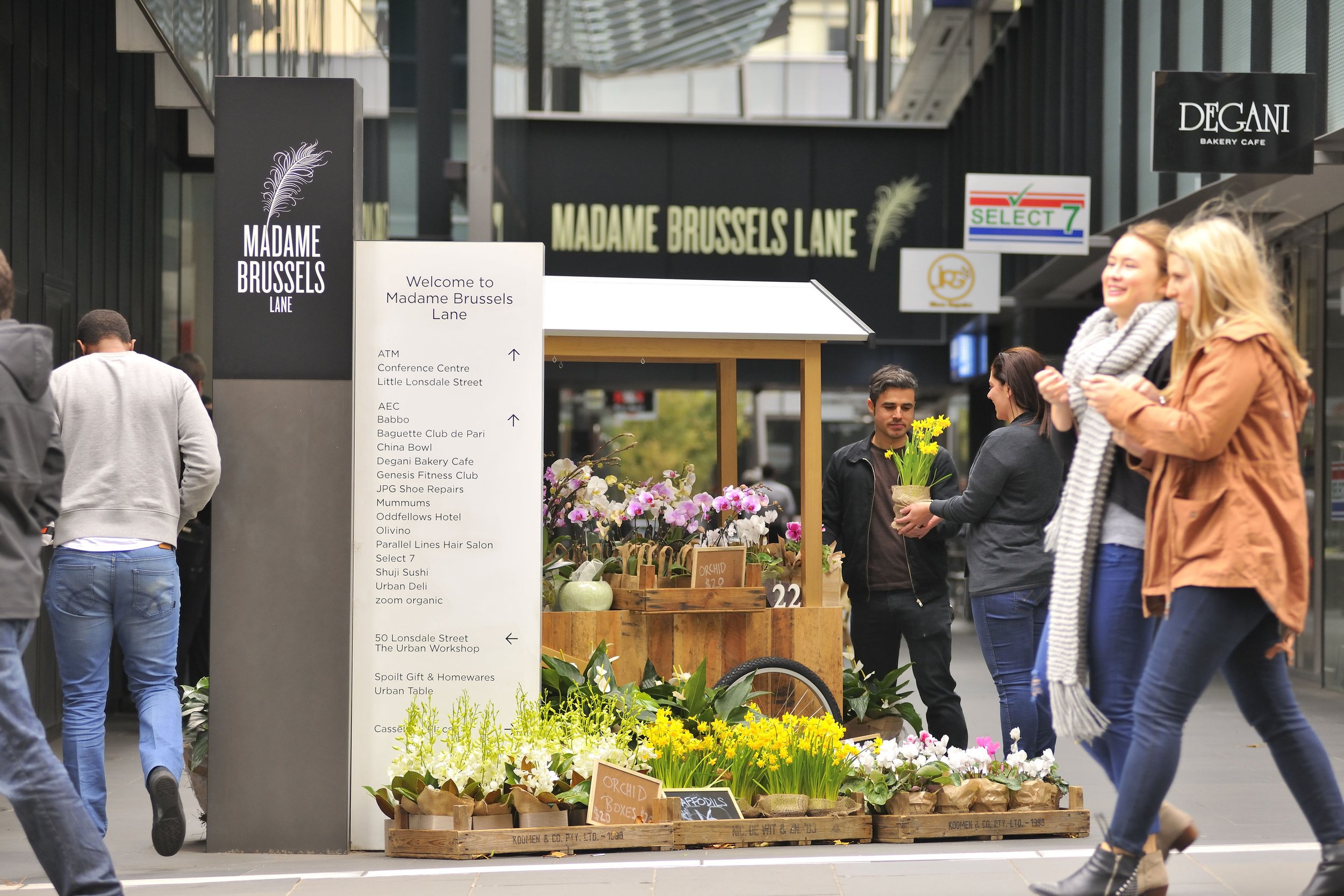
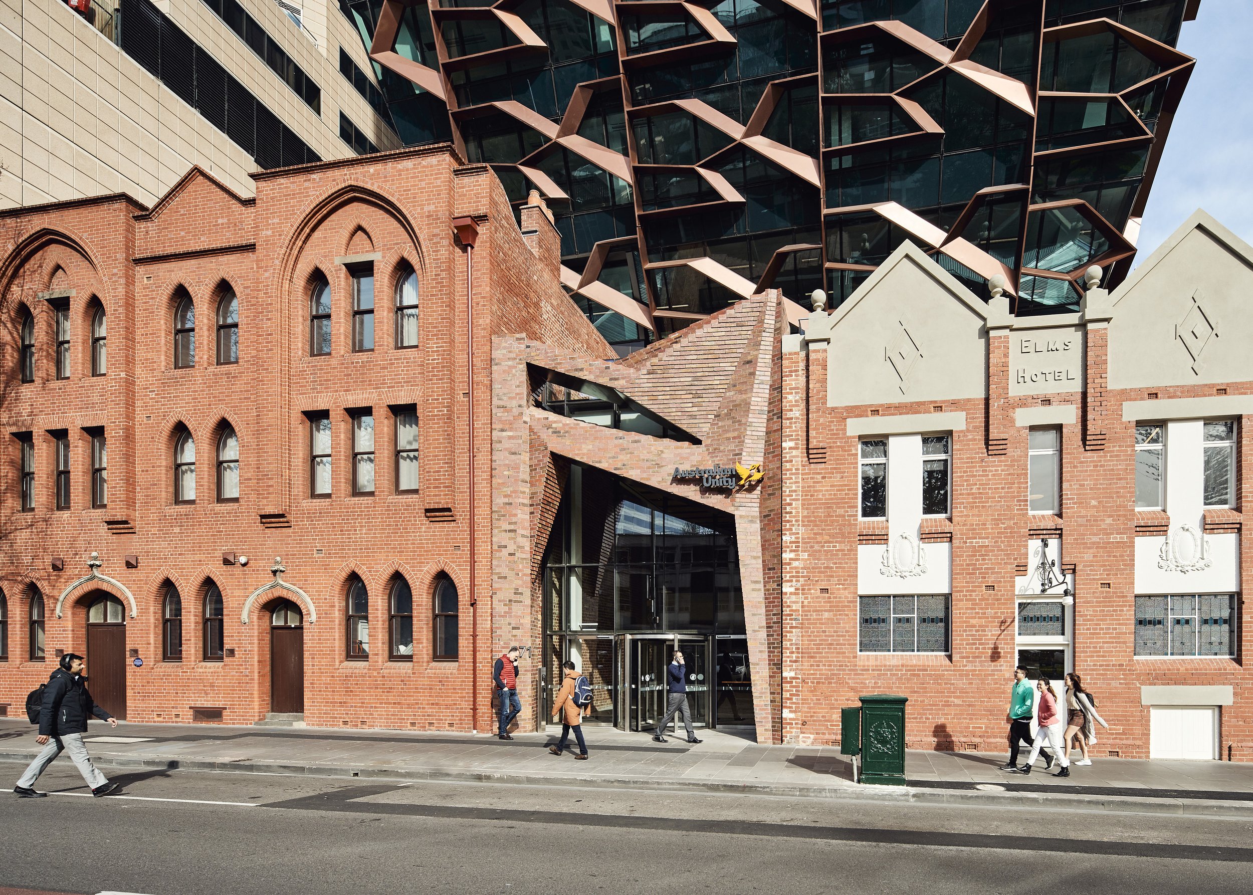
For over 25 years their properties have been meaningful places for the retailers, companies, government departments and communities that use them. The Lonsdale Precinct, strategically located in the north-east corner of the Melbourne City grid, comprises some of ISPT’s most valuable and best-performing assets within its $18.5 billion portfolio. The final addition was the completed 271 Spring St, serving as Australian Unity’s headquarters for the next 15 years. With Casselden first completed in 1992, it now comprises three cornerstone landmark A-grade office buildings, including 50 Lonsdale, 271 Spring and the food retail laneway known as Madame Brussels Lane, where some of Melbourne’s oldest heritage brick cottages remain.

BrandWorks was engaged by ISPT to assist with unifying the individual properties under one common name and brand. With over 11,000 people coming to work in and throughout its buildings each day, there was a window of opportunity to improve and add value to the precinct for the benefit of its public and private-sector tenants, office workers and ISPT. The placemaking and branding initiative entailed a series of workshops and interviews with all key stakeholders within ISPT and their tenants. Held over several weeks, visitors and workers were further engaged through public surveys and questionnaires for quantitative and qualitative research, data and analysis purposes. A research and executive report was tabled and presented to the Board, from which a strategic and brand direction was agreed.


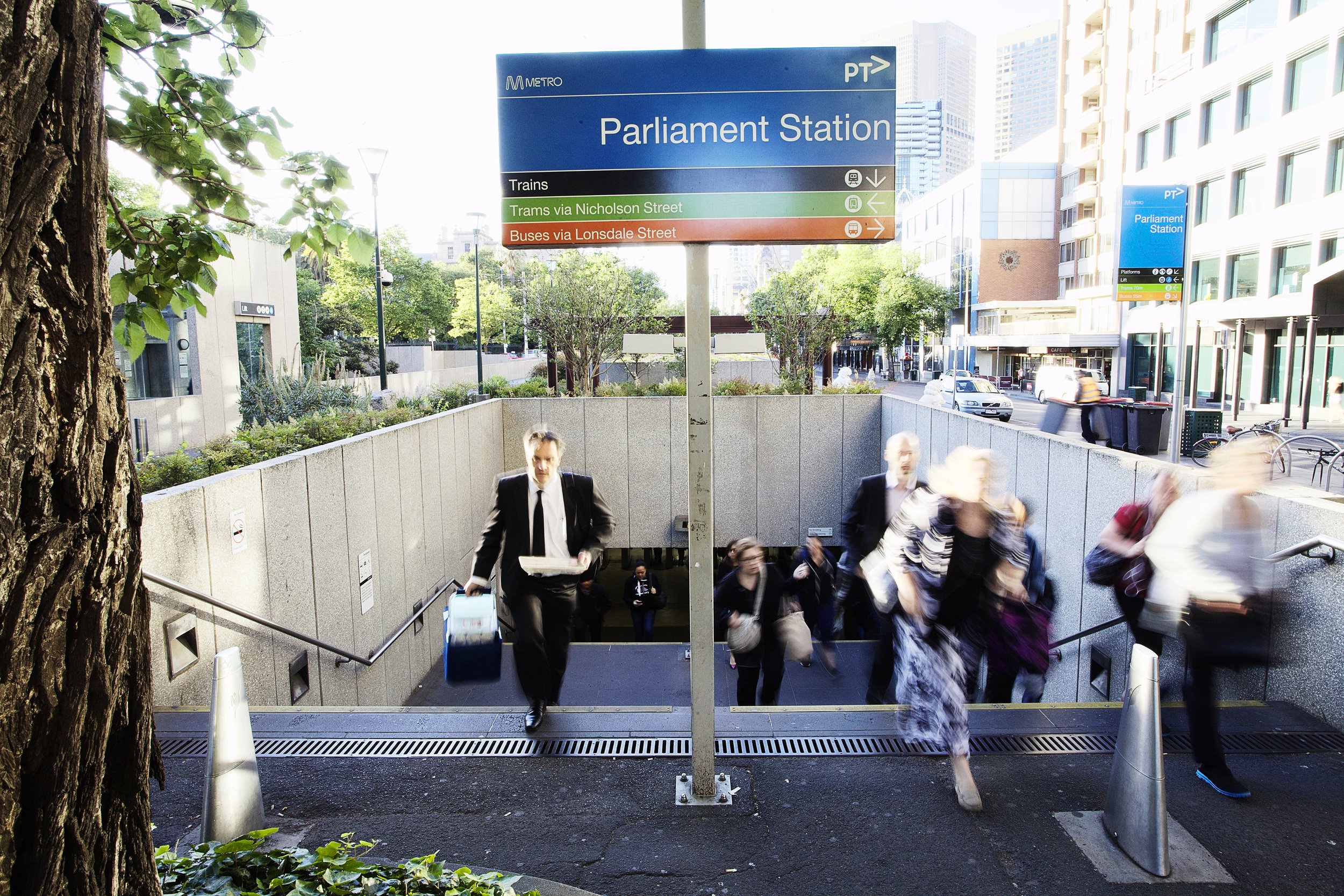

The name, Spring Place was chosen to unite the properties together and the brand identity was inspired by the surrounding environment, heritage overlays and proximity to public gardens and Parliament House. The brand evokes a welcoming and inviting feeling with bright colours to impart a fresh, humanistic and inclusive overtone. A tree-like symbol incorporating the S & P anchors the foundation of the brand’s story, acknowledging its history and contribution to Melbourne’s early beginnings and a place to create, work and thrive into the future.