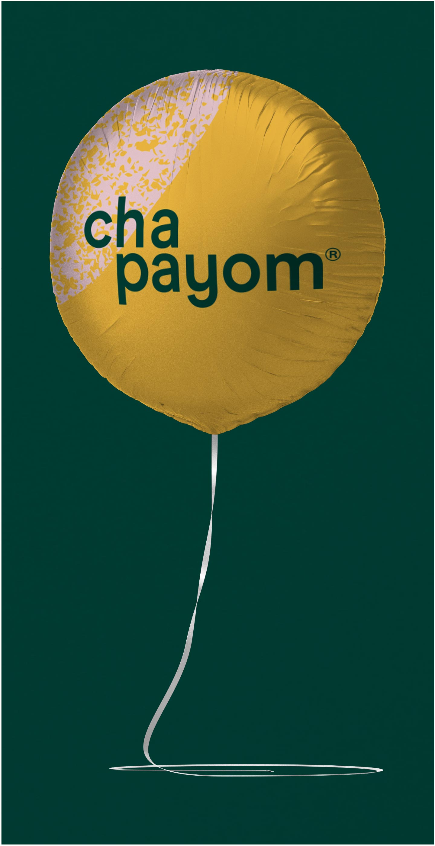
CHAPAYOM
STRATEGY, BRANDING, ART DIRECTION, COLLATERAL
Chapayom is a Thai tea franchise originating in Thailand and with stores throughout South East Asia. Now, for the first time, the brand graces Australian shores, starting in the Sydney CBD (add detail) and with the intention of expanding into other Australian cities (fingers crossed Melbourne!)
Chapayom’s Australian owners/franchisee’s came to BrandWorks to ensure they hit the ground running with an adaptation of the existing branding, tailored specifically to the Australian market.
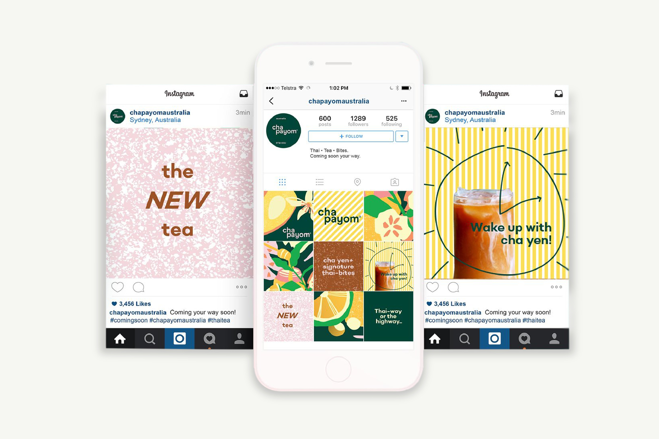
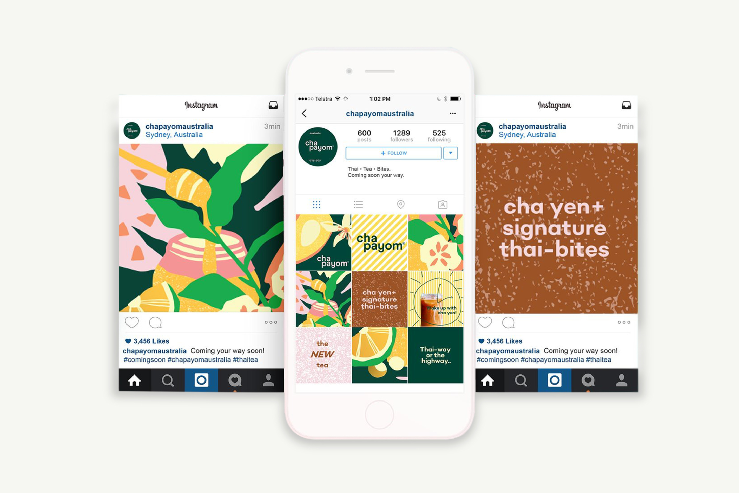
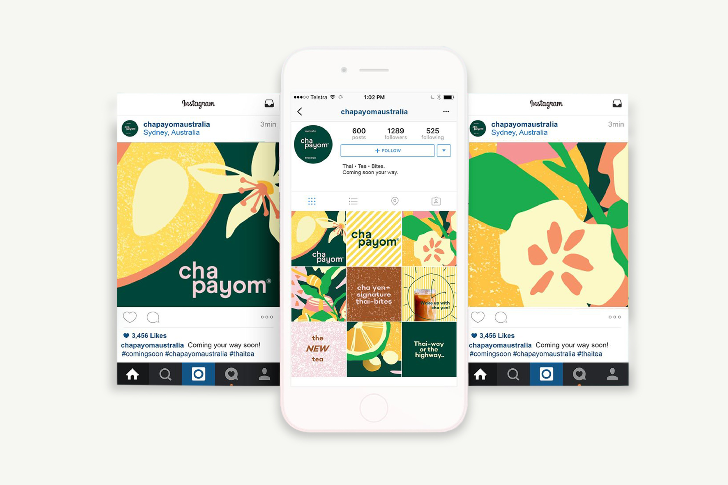
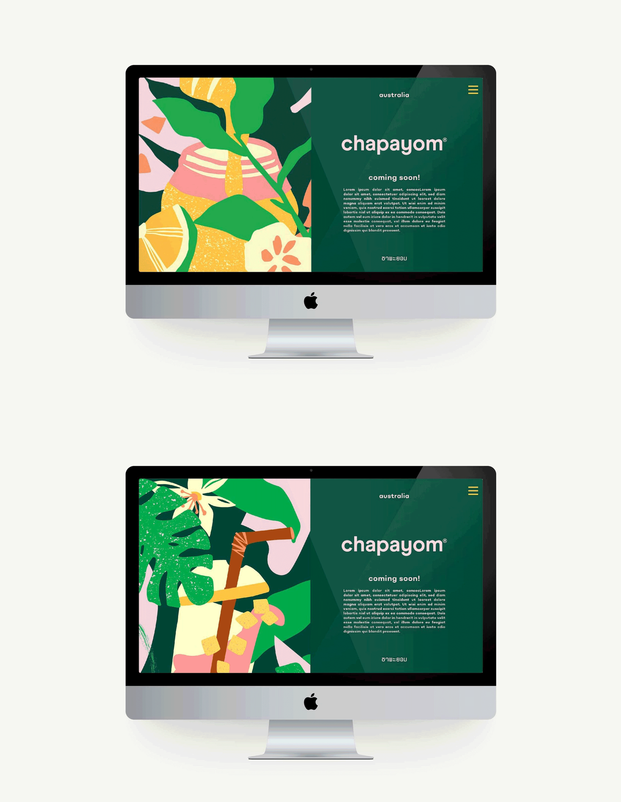
Our approach was to completely evolve and develop the original Thai branding while still holding on to specific core elements. We grew an extensive fruity colour palette around two inherited brand colours of grass green and chocolatey ochre. We also held onto the brand’s lower case stacking logo lockup but applied the format to a very current, friendly, geometric sans serif typeface called Modern Era from independent UK type foundry, OMSETYPE. The written Thai elements of the brand are the font Fixed by independent Bangkok based type foundry Produce.
To bring the story of the product to life, we commissioned Illustrator Nani Puspasari to develop a series of paper cut style illustrations of all the delicious tropical ingredients that go into Chapayom’s tea’s. With a brief of happy and humble, carefree and fun, the illustrations layer to create “still life’s” buzzing with movement. They were also developed as stand alone elements; a lime here, a logan berry there…always a riot of colour and flavour.
VIEW BRANDING VIDEO


