Bar Selecta (Branding)
Strategy | Branding | Collateral | Interior
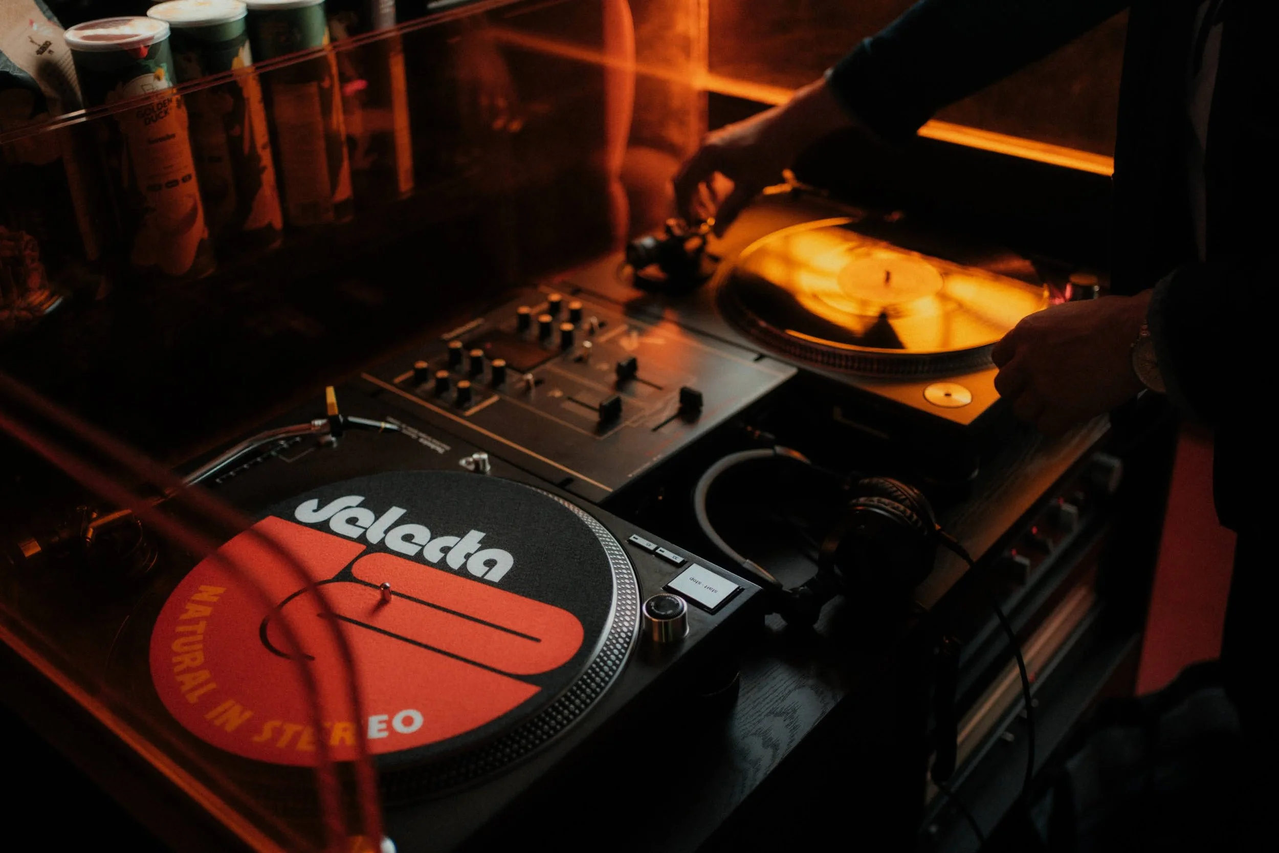
An Analogue Journey of Sounds…
Client
Michael Tan
Industry & Type
Bar
Services
Market Research
Concept Development
Customer Experience
Copywriting
Brand Creation
Logo
Brand Assets & Style Guide
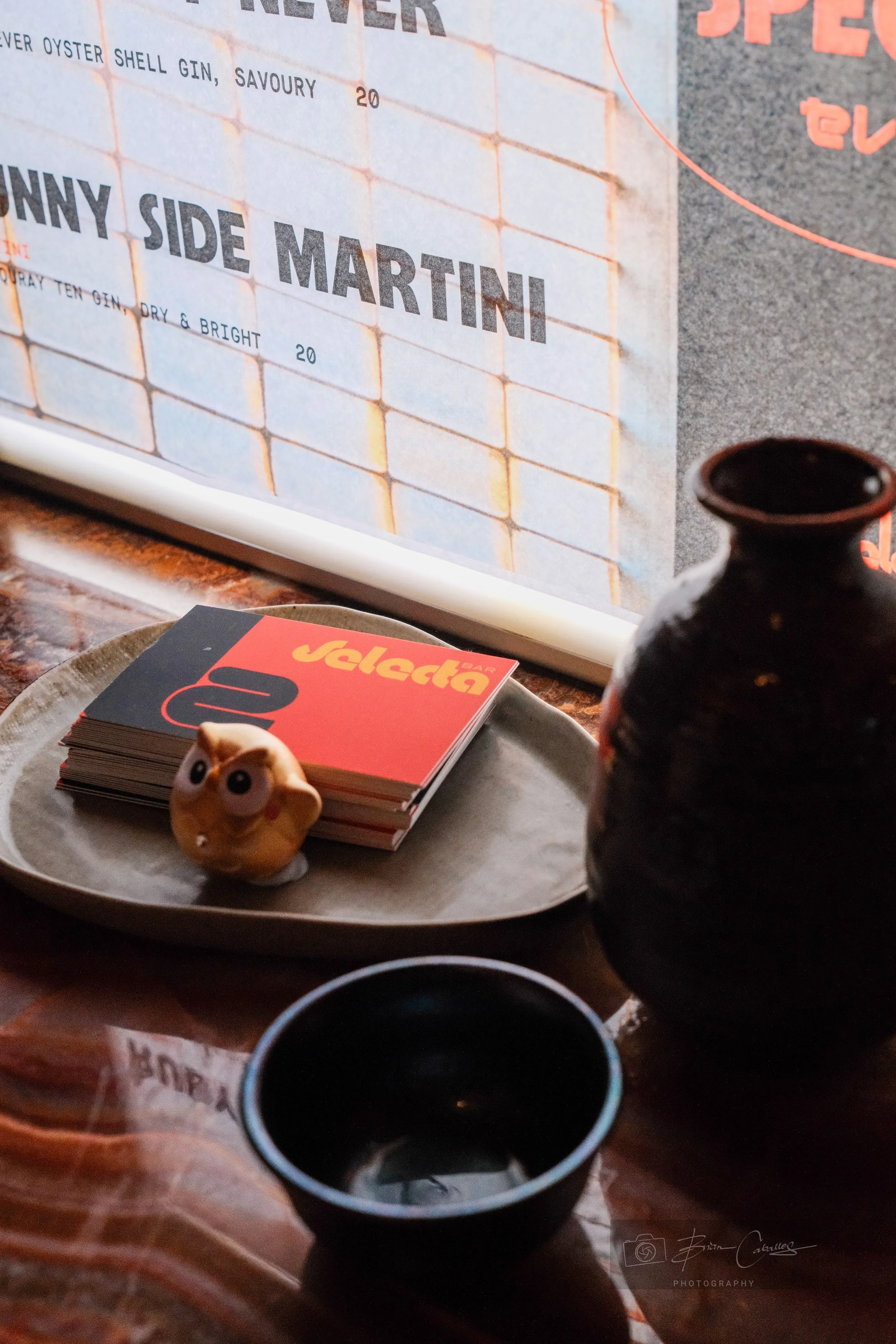
Print Collateral
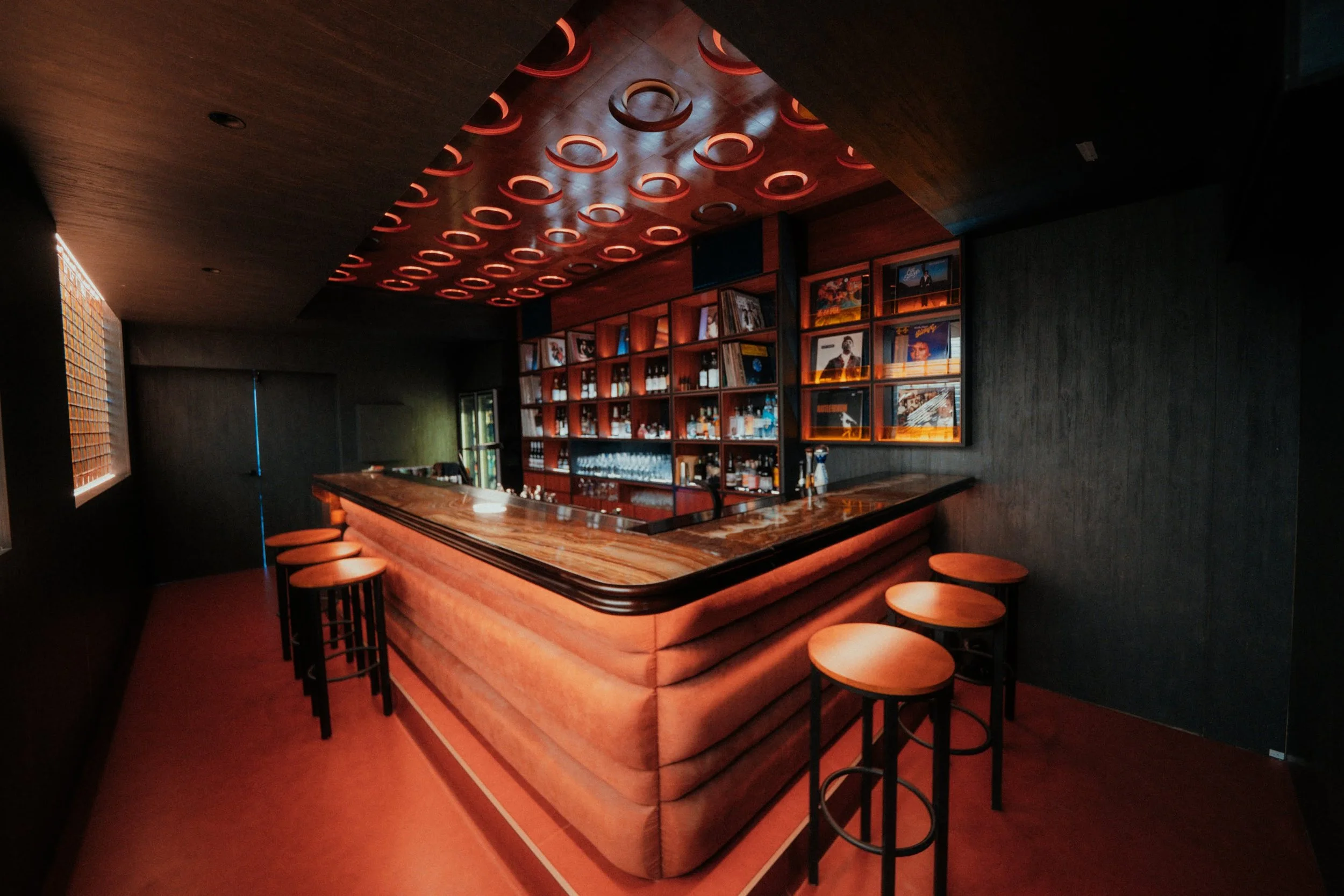
Interior Concept
3D Renders
Construction Documentation
Interior Styling
Signage
Social Media Content/Management
Brief
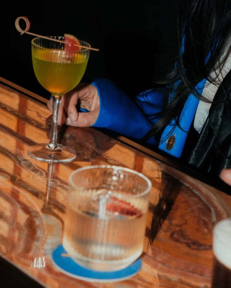
Bar Selecta, created by music-lover and hospitality operator Michael Tan, introduces a new kind of cultural venue to Melbourne: an intimate, 10-seat vinyl listening bar inspired by Japan’s iconic kissaten jazz cafés. The concept blends high-fidelity vinyl listening with refined mixology and Japanese street-inspired food. The branding captures this fusion of nostalgia and modernity, pairing mid-century warmth with contemporary minimalist cues to create a sophisticated yet unpretentious identity. Designed for those who savour great sound, crafted drinks, and atmosphere-driven experiences, Bar Selecta stands as a discreet sanctuary where music, mood, and design align in perfect harmony.
Approach
The brand is built by elevating nostalgia into a contemporary cultural statement. The identity deliberately layers retro cues, vinyl-era references and warm textures with a sharper, modern visual language to create a brand that feels both familiar and forward-thinking. Every element from typography and colour to tone of voice is crafted to balance rhythm and refinement, capturing the interplay of chaos and control that defines the Selecta spirit. It’s branding that doesn’t imitate a genre; it remixes it.
At its core, the brand is designed to cultivate connection. Bar Selecta’s visual and verbal identity invites guests to slow down, stay longer and feel part of the scene. The branding champions a human, lived-in warmth wrapped in a polished, Melbourne-informed edge, ensuring consistency across signage, packaging, collateral and experience. The result is an identity that holds its own as a cultural anchor, expressive, confident and built to grow with the community around it.


Outcome
Inspired by the energy of selectors in music and nightlife, the name hints at a place where rhythm, personality, and experience are intentionally crafted. It suggests a venue where every moment is selected with care, inviting guests to lean into the atmosphere, stay longer, and become part of the ongoing soundtrack of the space. This notion of selection and storytelling became the foundation of the brand identity, influencing the visual language and the tonal attitude across all touchpoints.
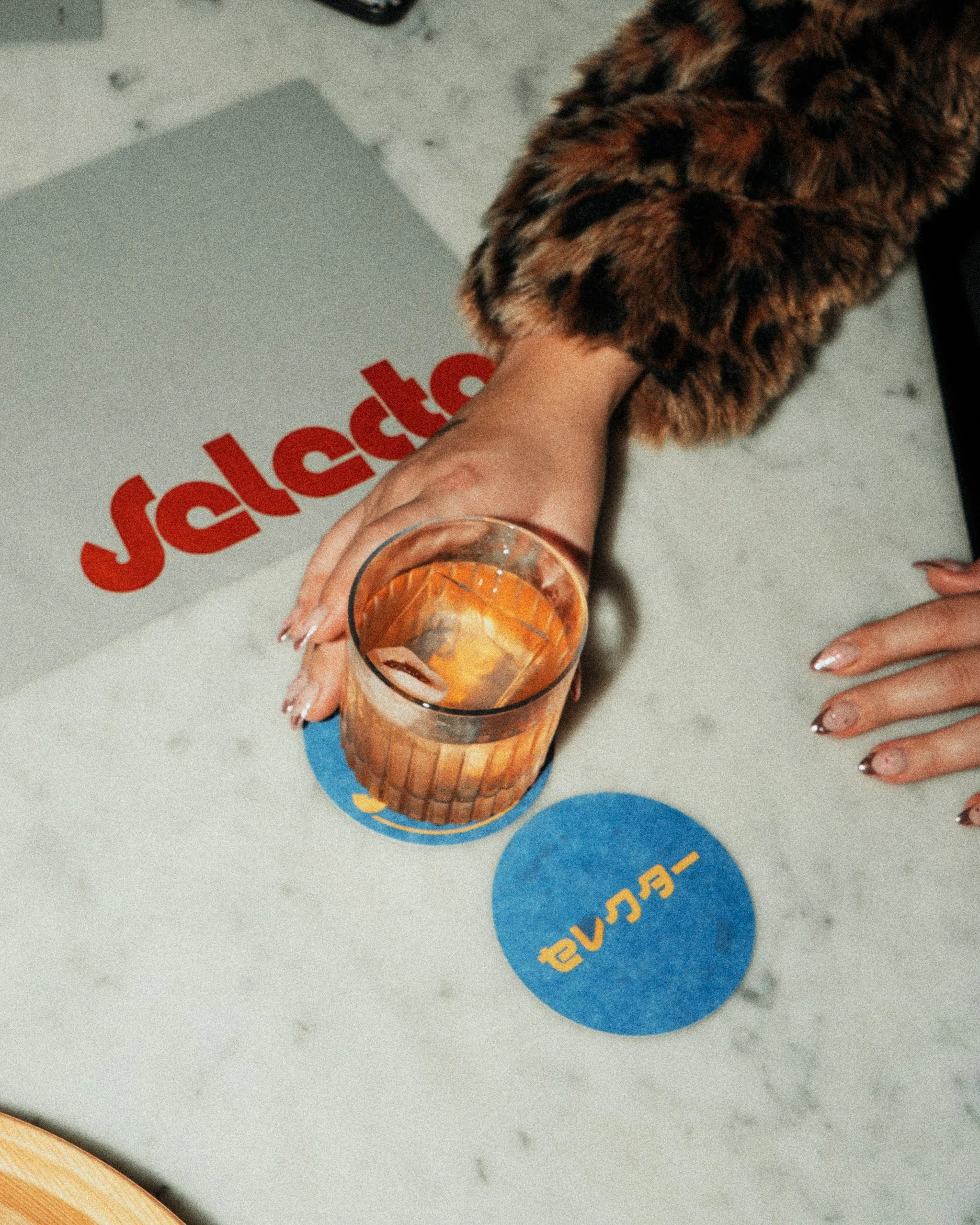
The brandmark for Bar Selecta is bold yet refined, shaped to echo the dual nature of the venue; part analogue soul, part modern edge. The typography references the world of vinyl, radio culture, and classic signage, translated into a contemporary typography that feels confident and unmistakably Melbourne. The blue and orange colour palette was chosen to amplify this balance: a deep electric blue brings coolness, sophistication, and a sense of evening vibrancy, while the punch of warm orange injects rhythm, heat, and the social spark that defines the venue. Together, they form a high-contrast duo that feels both nostalgic and fresh, allowing collateral to stand out without overpowering the eye.


To further express the identity, the design embraces a deliberate use of negative space, allowing the louder visual moments strong type, colour blocks, and rhythmic motifs to breathe. Textural overlays, subtle grain, and graphic gestures inspired by old-school audio equipment add tactility and personality to the brand, ensuring it never feels flat or overly polished. This play of structure and spontaneity mirrors the concept of “curated chaos” at the heart of Bar Selecta. The result is a vibrant, dynamic, and memorable brand identity that captures the venue’s character.
Client Testimonial
“Bar Selecta is a 10-seater Japanese-inspired music listening bar, born from a love of vinyl, acoustics, bar craft and connection. We asked BrandWorks to help us bring a quiet, niche idea to life—something that captured the spirit of Tokyo’s kissaten bars but reimagined for Melbourne. What they delivered exceeded every expectation. The interiors are where the magic happens. BrandWorks didn’t just design a space—they designed an experience. Every material, finish, and spatial cue supports our mission: to slow down, tune in, and be present. The lighting, acoustics, and flow of the room are meticulously considered to balance intimacy with performance; elevating sips with sound. But what makes this project award-worthy is the way BrandWorks seamlessly wove strategy, branding, and interiors into a singular, unified vision. Their interior design is not standalone—it’s the physical expression of a clear brand world. Our service philosophy is ‘Omotenashi’, where care is considered first beyond expectation. You feel the narrative as soon as you walk through the door. They understood the importance of designing for the senses. They elevated a simple concept into something emotionally resonant and operationally smart. Their team was thoughtful, detailed, and genuinely invested in our success. Since opening, Bar Selecta has been featured by some of Melbourne’s most respected publications, including Good Food, The Age, Broadsheet, New York Times Australia, Beat Magazine, Delicious, Sitchu, Hypebeast, and Boothby, among others. The response has been overwhelming. Night after night, guests arrive as strangers and leave having shared conversations, and making new friendships—exactly the kind of connection we dreamed of creating. It’s rare to find a creative partner who truly understands your vision and can bring it to life with such integrity and depth. It’s rare to find a partner you can trust this deeply—with BrandWorks, we did.”
— Adam Ong, Strategy & Partnerships, Bar Selecta.