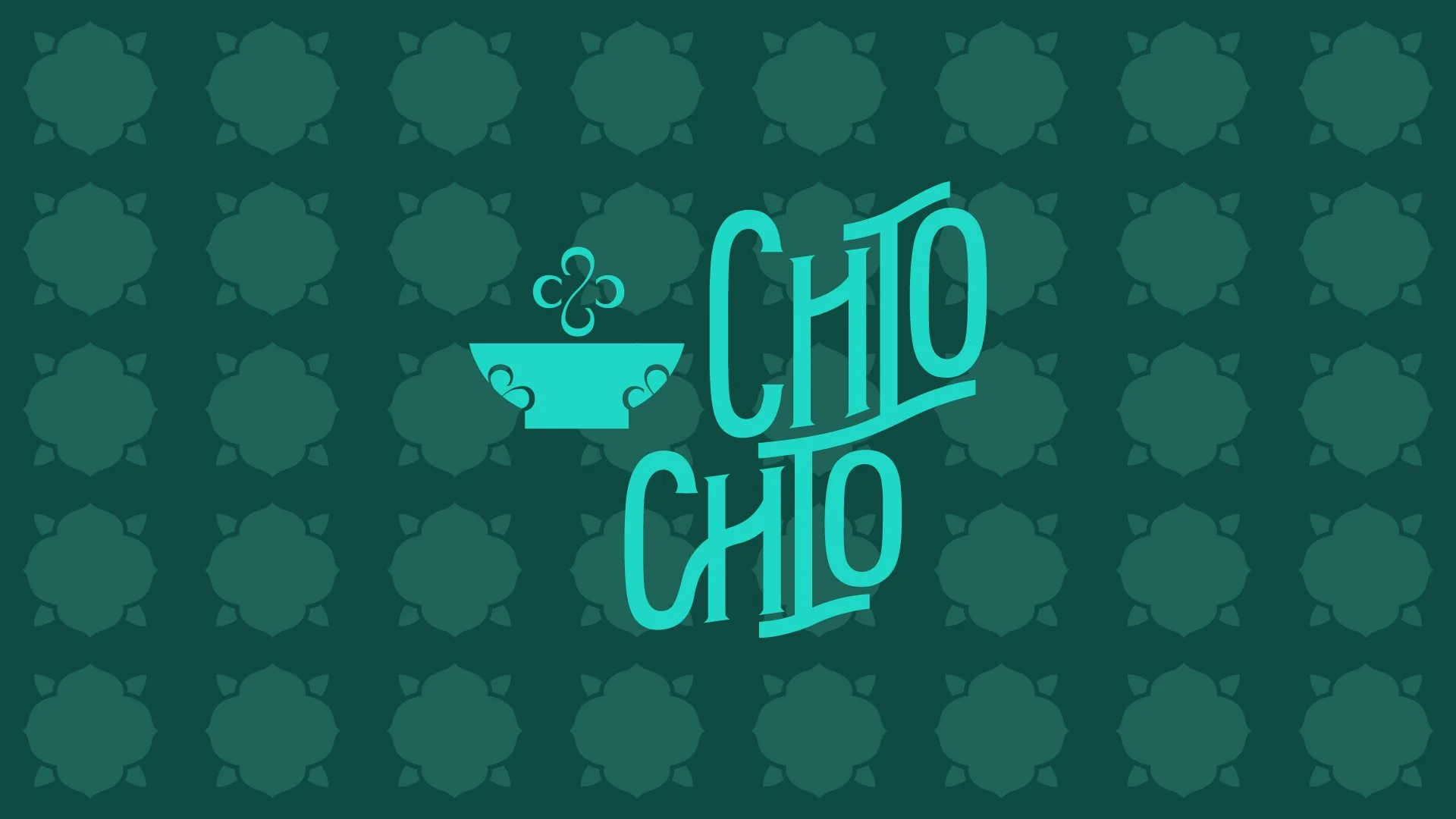
Chio Chio
Strategy | Branding | Collateral

Heritage with a Wink

Client
Aloft Kebon Jeruk
Sector
Restaurant
ADD
Services
Market Research
Concept Development
Copywriting
Brand Creation
Logo
Brand Assets & Style Guide
Print Collateral
Brief
Chio Chio is the signature restaurant concept for Aloft Jakarta Kebon Jeruk’s All Day Dining, created ahead of the hotel’s 2025 opening. Inspired by Peranakan heritage yet designed for a youthful, urban market, the brand needed to capture the spirit of a modern Nyonya — expressive, cheeky, and full of charisma.
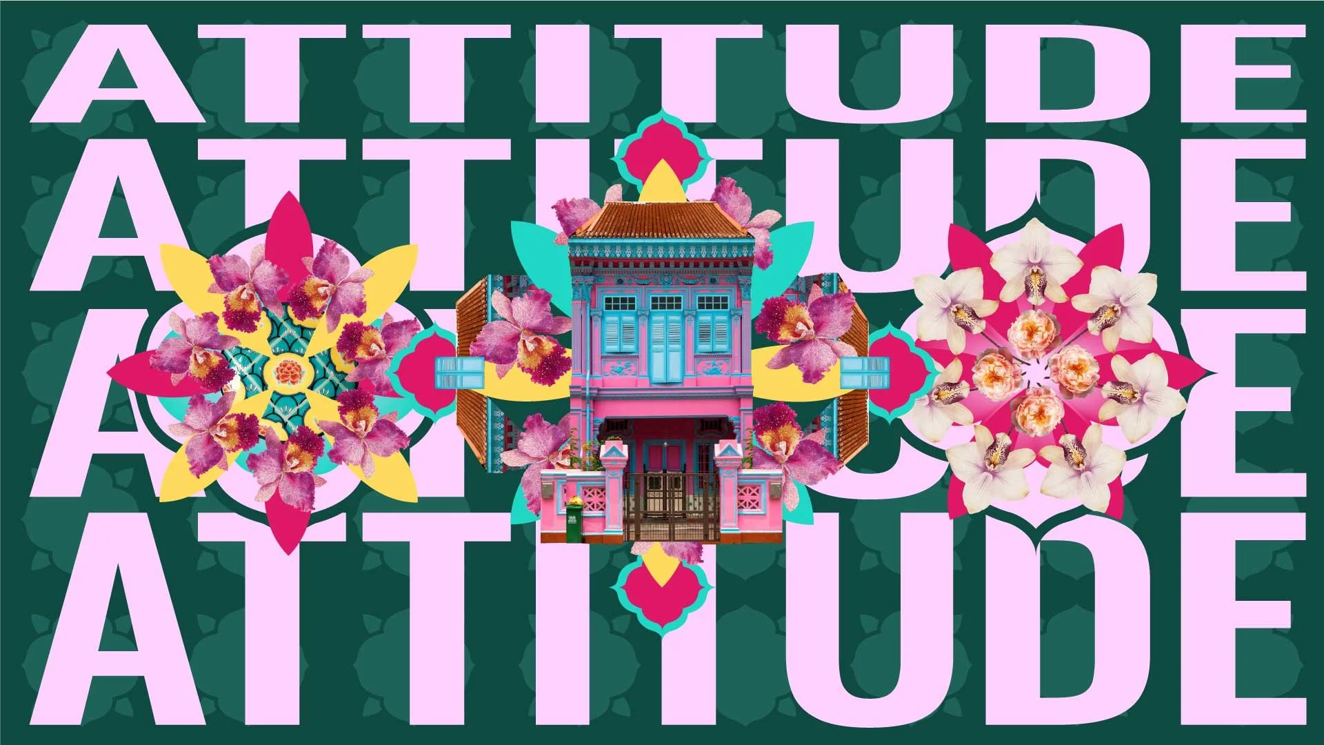
The venue reintroduces Peranakan culture to the city through a fresh, contemporary lens. Rather than placing heritage behind glass, the concept brings it forward with confidence: bold flavours, vibrant colours, and stories passed from generation to generation — all retold with a wink.
BrandWorks was appointed to craft the brand strategy, narrative, moodboard, visual identity, and initial applications, ensuring Chio Chio becomes an iconic, memorable anchor within Aloft’s energetic F&B scene.
Approach
BrandWorks approached Chio Chio by first grounding the brand in a strong strategic idea: heritage expressed with modern attitude. The goal was to reinterpret Peranakan culture without nostalgia or formality — instead celebrating its expressive, playful, and bold side to suit Aloft’s youthful energy.
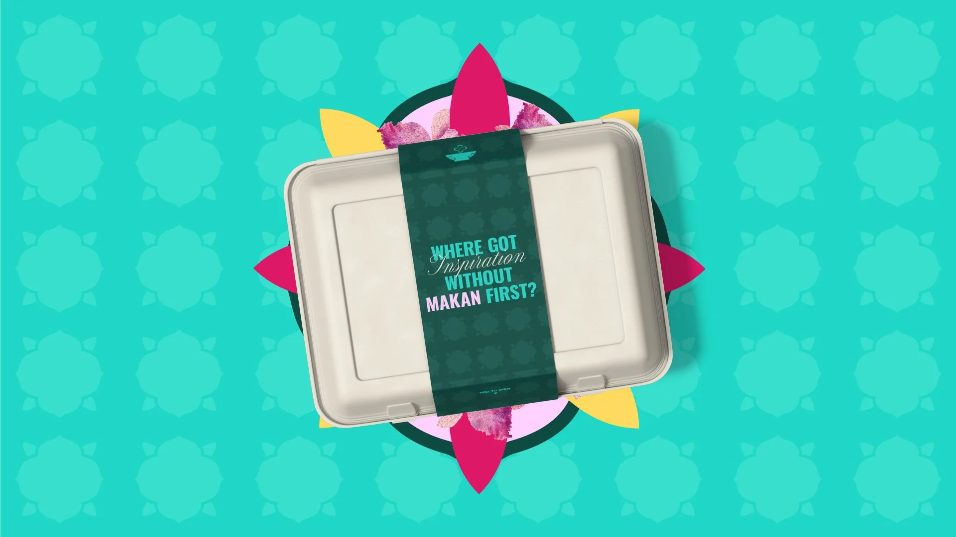
The design direction drew from cultural memory — porcelain bowls, floral tiles, jade jewellery, embroidered kebayas — and translated them into contemporary graphic expressions. Rather than replicating traditional motifs, the team abstracted, simplified, and stylised these references to create a system that feels modern, vibrant, and distinctly urban.
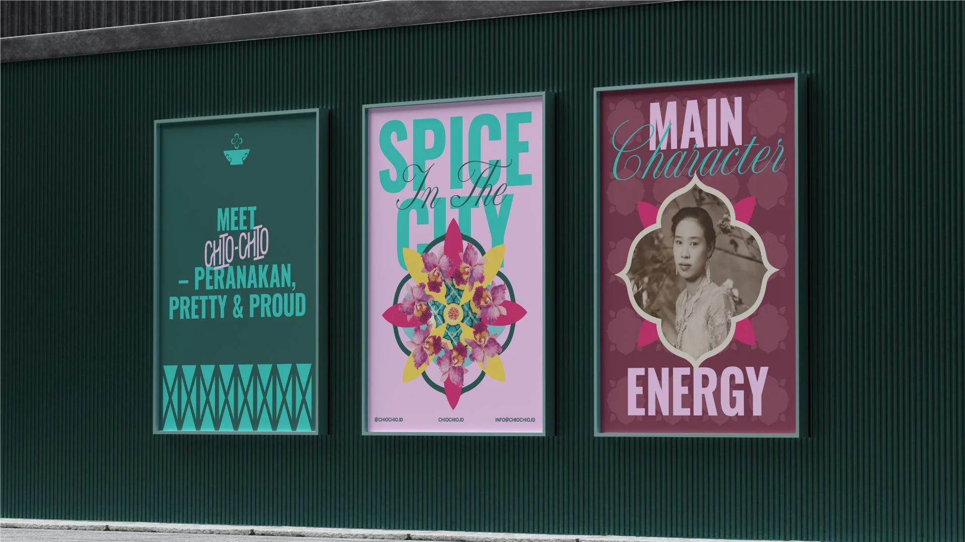
A personality-led narrative was also central to the approach. The brand voice channels the spirit of a cheeky, confident modern Nyonya: warm, witty, and full of life. This informed copywriting, tone, expressions, and the overall emotional feel of the brand.
The result of this strategic approach is a brand identity that respects heritage while ensuring it remains relevant to today’s diners — expressive, layered, and unmistakably Chio Chio.
Outcome
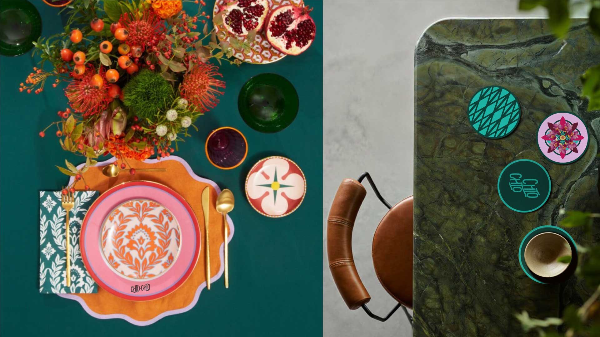
The final identity delivers a bold, contemporary interpretation of Peranakan culture across all touchpoints. The logo features a modernised floral emblem formed from repeating “C” shapes, paired with a confident wordmark that blends tradition and youthful character. The colour palette balances jewel-toned vibrance with refined neutrals, creating a system that feels festive yet elevated.
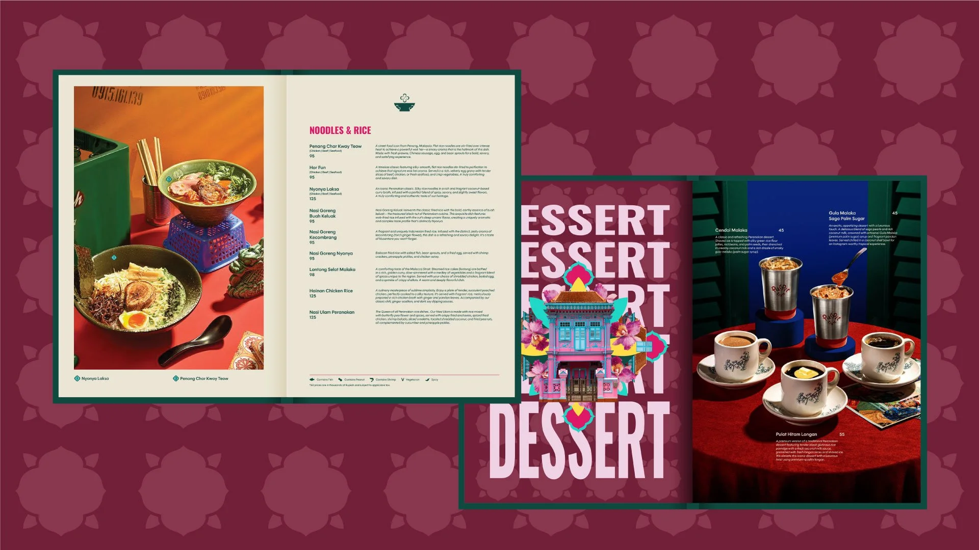
Patterns derived from reimagined tilework provide visual richness across menus, collateral, and environmental applications. Playful graphics, expressive typography, and a distinctive verbal tone bring personality into every piece of communication — from dining menus and posters to merchandise and social media layouts.
Together, these elements create a cohesive brand world that feels alive, stylish, and culturally resonant. Chio Chio becomes more than a dining venue; it becomes a modern cultural experience within Aloft Jakarta, where heritage is not preserved — but performed, reinterpreted, and celebrated with attitude.